Fragments of Him – A game about life has never felt so lifeless
**
Reviewed July 09, 2016 on Xbox One
Leave a comment on Giant Bomb
Fragments of Him is a rare example of a game that is made worse by being interactive, and features a narrative likely better told as a short film. A strong core concept is stretched too thin; clunky mechanics and terrible pacing make the game's two-hour length feel far too long, and ultimately removes any emotional impact the game may otherwise have. It's a shame, as the game is tackling difficult concepts - the death and mourning of a loved one - that are not frequently addressed in video games.
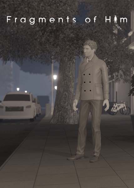
At its core, Fragments of Him is a narrative-driven exploration game, telling the story of the life and sudden death of a man on the verge of settling down with his partner. The man's history is explored from three perspectives: his grandmother, an ex-girlfriend, and his current boyfriend. The player takes on the role of a disembodied camera, selecting objects in the environment to hear a character's thoughts regarding it, and watching events unfold from a third-person view.
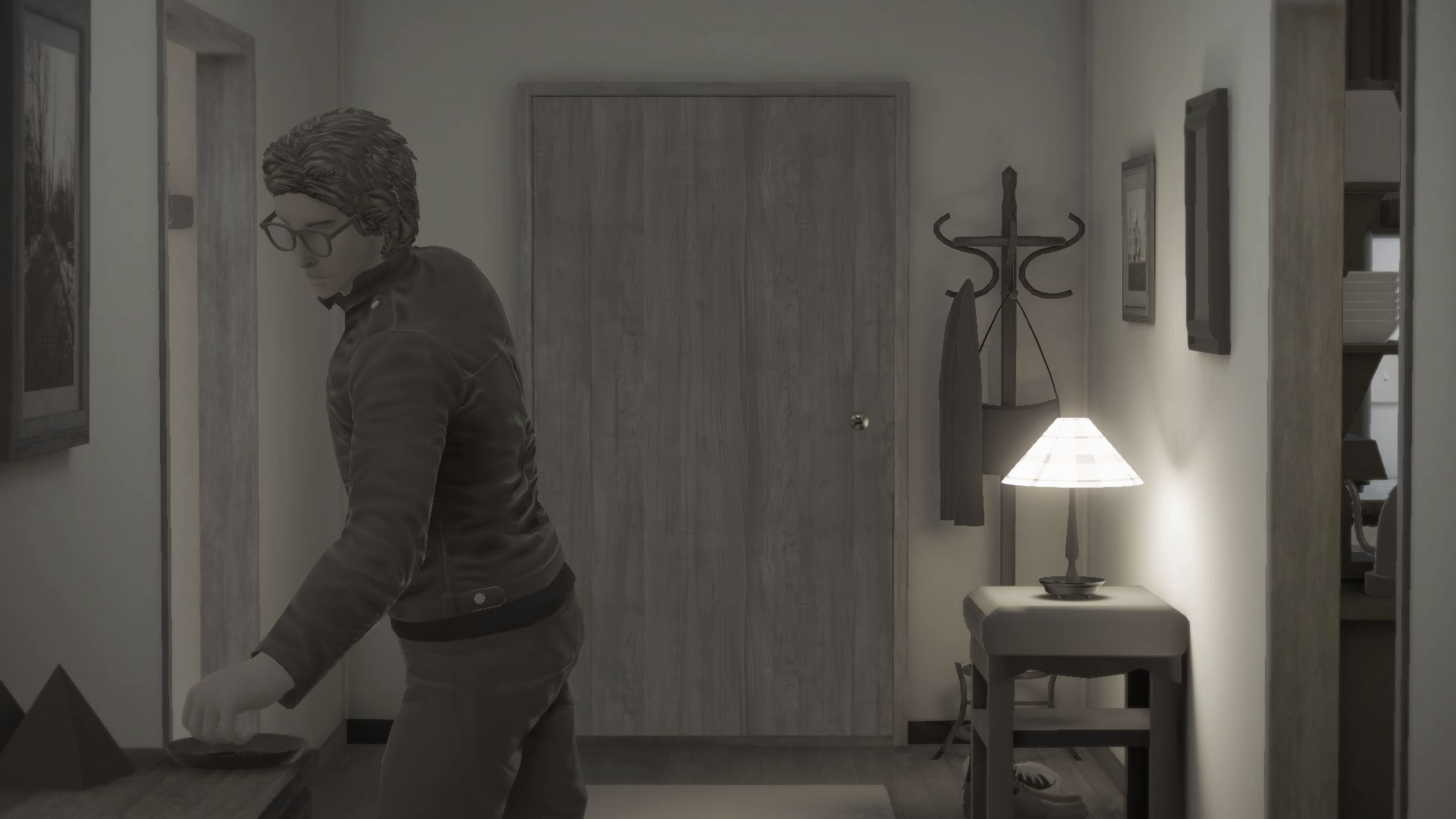
It is this gameplay that is my main frustration with Fragments. Most of the time, there is only a single object in the environment with which to interact. Selecting this object typically results in a single line of dialogue and then another object must be selected. This destroys any sense of pacing that the game has - internal monologues that seem to have been recorded as longer segments are delivered a line at a time, and the object highlights are subtle enough that it was easy to overlook items. It simply isn't fun, nor does it add to the narrative - what should be a poignant moment is too often interrupted by pixel-hunting for a toothbrush that I had overlooked.
This would be somewhat excusable if I was free to explore the environment as I pleased, but Fragments is essentially a linear game. The next object triggers the next line of dialogue, or next event, almost without exception. It leads to the interactivity feeling false, and I thought, on multiple occasions, that this should just be a film instead of a game. This is not to say all games need high levels of interactivity - I have loved visual novels, such as Steins;Gate, in the past - but here it detracts from the experience.
The pacing of the game is not helped by the writing. I'll say it again - the central concept is strong, and the team should be applauded by exploring difficult themes. However, Fragments drags its ideas out, with what could be a good 30-40 minute script being stretched to over two hours. Character traits that can be demonstrated within minutes are repeated multiple times and disrupt the flow of the story. An entire scene, lasting around five minutes, is repeated in its entirety, as far as I can tell without any changes and seemingly without good reason. It just feels like needless padding in a game that is already too long for its own good. This is further exasperated by the way characters move in the game - selecting a character, rather than an object, results in them teleporting to another point in the room. Crossing a single room may take four such actions, which seems needlessly slow.
It's particularly unfortunate as the writing at times is very good. A few scenes, such as a Christmas dinner scene, stand out from the rest, and is shown from multiple character perspectives. This layering works well to develop the characters, and the characters are well voice-acted. Had the game focused on these strengths, it could have been an extremely engaging experience.
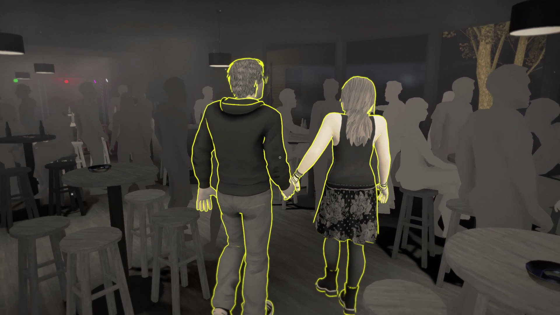
Artistically, the game was somewhat of a mixed bag for me. The stark, flat art style generally works well to convey the themes and feelings of the game, but the featureless faces and minimal animations makes it difficult, at times, to emphasise with the characters. Side characters and NPCs receive an essentially generic pure-white/grey texture. Whilst this work well, and looks rather striking, for NPCs that aren't relevant to the story (such as the crowds in a bar scene), the use of such generic skins for the main character's parents looks out of place.
Finally, a quick note on performance. I only tested the Xbox One version of the game, but the frame rate is rather poor in many areas. Due to the point-and-click nature of the game, it isn't a fatal flaw, but the camera motion does feel sluggish as a result. Spinning the camera whilst stationary in pretty much any room in the game revealed major swings in the frame rate - some parts of the room were buttery smooth, but when, for example, a window came into view, the frame rate took a steep dive.
I wish I liked the game more; the team here clearly had some great ideas for exploring difficult themes, but unfortunately the execution falls flat in so many ways.

