Inversus – A combination of innovative gameplay and elegant minimalism
*****
Reviewed August 16, 2016 on PlayStation 4
Leave a comment on Giant Bomb
Disclosure: A PlayStation 4 download code was provided by the publisher for this review
Usually when I pick up a game, if I know the genre, I have a rough idea what I'm in for. Inversus defies that convention; I simply can't think of another game quite like it, nor do I even really know in what genre I'd categorise it. The only thing I could come up with as a concise description is "minimalistic top-down twin-stick(ish) real-time strategy game", which is possibly the most precise yet useless thing I'll type all year.
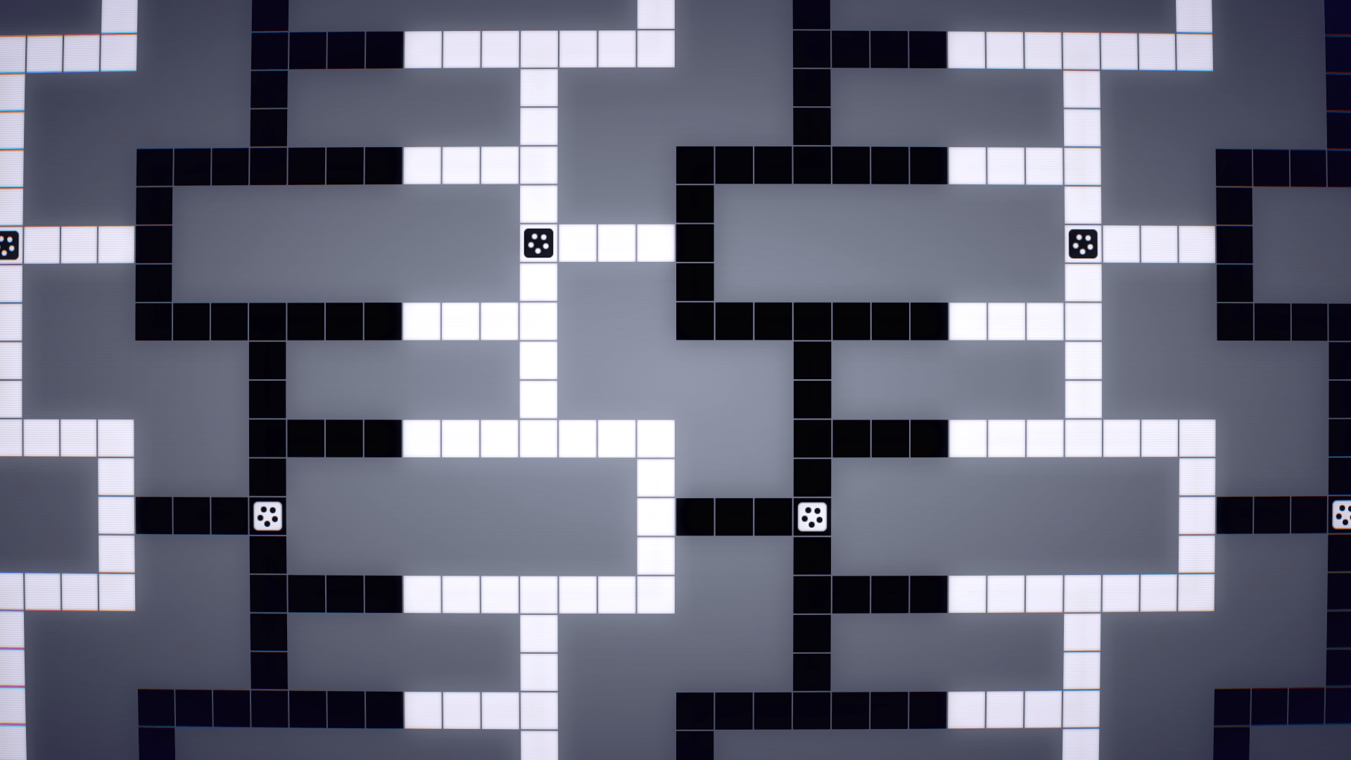
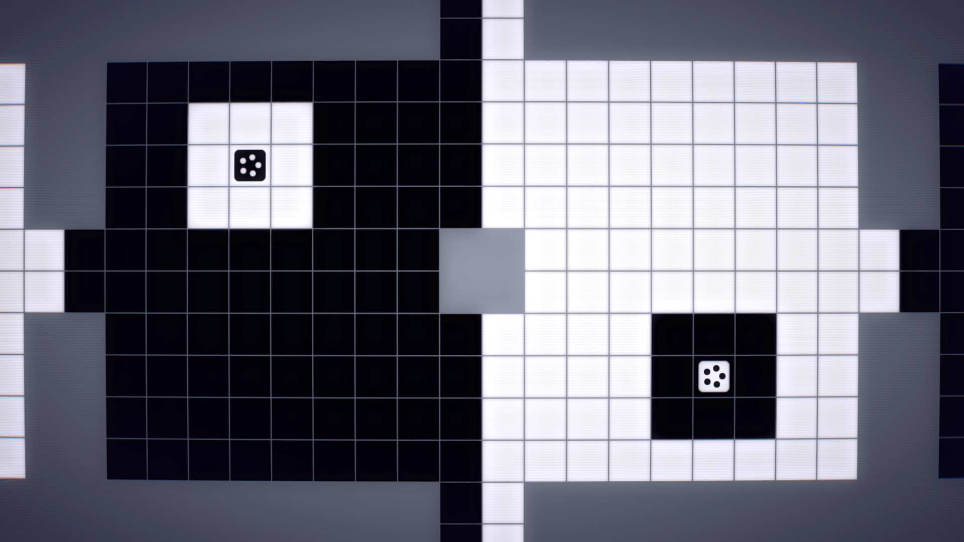
At a first glance, Inversus is deceptively simple. One to four players are constrained to a black and white grid; black characters can only move on white squares, white characters can only move on black squares. A shot can be fired in any four of the cardinal directions, which can both destroy enemies and flip tiles to a passable colour. The shot continues to flip tiles to the player's colour until it hits an enemy or a wall. It's as if someone dropped a real-time strategy game onto an in-progress game of Reversi. The objective is also simple - in single-player, survive waves of enemies; in multiplayer, destroy the other player/team.
This apparent simplicity hides the fact that Inversus is a well-balanced game that is extremely fun to play, and the game feels different every time I play. A well-timed shot can provide an escape route, or cut off an opponent, and the grid almost feels alive - paths I can take are constantly changing as I try to trap my opponent so I can make the final decisive shot.
This only works because the game is so carefully balanced. The number of shots are limited, and take a number of seconds to reload. If I shoot too fast, I find myself waiting a brief eternity while my opponent cuts off my escape routes. If I shoot too slowly, I'll never constraint my opponent and achieve victory. This is a really smart system that makes the game feel frantic yet paced. One minute I'll be making a split-second dodge to avoid incoming fire; the next I'll be thinking out a spaced set of moves to try and trap an enemy. The combination of the relief that comes from quick reflexes and avoiding fire, and the tension that comes with a planned series of actions, is a brilliant combination. It took a few games for it all to click into place, but once it did, I loved every minute of it. It may look simple, but there is a surprising amount of depth and strategy here.
Some of this depth comes from the number of play fields that can be chosen. In the versus mode, there are 27 maps. Some are simple, open grids of various sizes, others have one-tile wide paths that can be a deathtrap or a lucky escape, and some wrap around - go off the top, and appear at the bottom. Each plays very differently, and a strategy that works on one may spell doom on another. The game also has a charge shot, which shoots across three tiles instead of just one. My first instinct was to always be charging, but I quickly realised that this slowed my movement speed, and the right shot type had to be chosen depending on the situation.
This sense of simple-yet-deep extends to the game's style. At first, it seems to be just stark black-and-white squares, but a number of subtle touches make this game a great example of elegant minimalism. There's is a very slight curvature to the screen, and a subtle scanline-like effect. This isn't an exaggerated CRT-filter (it's subtle enough that I didn't really notice it for the first hour or so), but just enough to make the game feel like an arcade game. Firing a shot pushes the player back slightly, and getting hit or firing a charge shot causing the entire screen to shake. As the screen shakes, there is a slight chromatic aberration effect added to the grid. Normally this is something I hate in games, but the quick, barely noticeable, flash of colour in an otherwise black/white/red world looks great here. Similarly, moving around leaves a fading colour trail behind the player, which is both a useful cue of watching a player's movements and a nice stylistic touch. This combination of minor details makes the game feel crafted, and it is an elegant way to inject style whilst maintaining the game's minimal aesthetic.
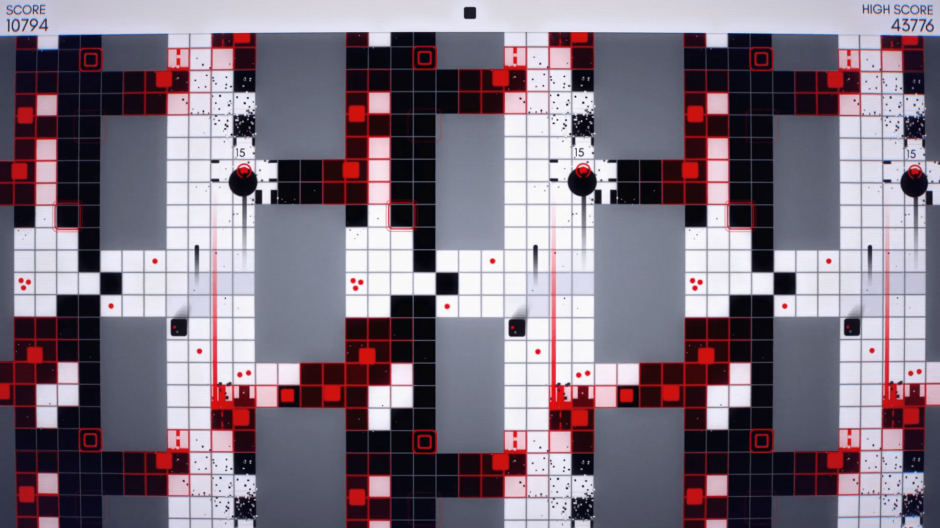
The versus mode discussed above is the clear highlight of the game, and is playable both locally and online. The game's single-player arcade mode is also fun, but feels somewhat lacking in comparison. There are only six maps here, rather than the versus mode's twenty-seven, and there are only two enemy types. There is a red enemy, which flips tiles as it moves near them, and there is an enemy which functions much the same as the player. There are still some great touches in this mode - the screen taking on a red tint from the red enemies as I begin to get overwhelmed, for example - but it would have been nice to see this mode fleshed out a little more.
Overall, however, Inversus is an exceptionally well-crafted game, and the thoughtful touches and well-balanced mechanics elevate it far beyond its simple core. Pretty much every element of the game feels like someone spent hours thinking about how to make it just right. This is an excellent game, and I had a huge amount of fun playing it.


